
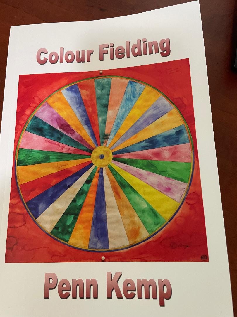
Colour Fielding
Tracing the Radical Geometries of Mid-Century London, Ontario Abstract Art through Verse

“Colour Fielding”
A daughter’s poetic dive into her father’s studio.
By Bryan Parker Lavery
To enter the London, Ontario home of Penn Kemp is to step directly into a living, mid-century canvas. Surrounded by the massive, vibrating abstract works of her late father, Jim Kemp, the poet laureate does not merely remember local art history; she lives inside its aesthetic world. In her latest collection, Colour Fielding, published by Silver Bow Publishing, Kemp undertakes the perilous poetic errand of translating this massive, wordless spatiality into the narrow confines of the printed page. The result is a striking series of quantum-linguistic experiments that prove abstraction is never a retreat from reality, but a headlong dive into it.
Emerging from New York City during the 1940s and 1950s, Colour Field painting sought to rescue abstract art from the frantic, gestural angst of Abstract Expressionism. Deeply inspired by European modernism, many of its notable early proponents were actually among the pioneering abstract expressionists themselves before they chose a different path. Instead of jagged brushstrokes, artists like Mark Rothko, Barnett Newman, and Helen Frankenthaler offered weighty, unmodulated planes of pure hue. They treated colour not as a vehicle for a subject, but as the subject itself, creating what Rothko called “a religious experience through sheer visual scale.”
This project arrives at a historic moment for the author, who was recently honoured by the League of Canadian Poets with their Inaugural Lifetime Achievement Award—a testament to her six decades of rewriting the rules of Canadian literary experimentalism. For Kemp, the collection operates less as art criticism and more as a deeply personal, intensely familial archive.
Jim Kemp was a foundational pillar of London’s burgeoning mid-century art scene, a beloved mentor and tireless organizer who built the institutions that defined the local creative landscape. He was instrumental in establishing the Western Art League, organizing the Art Mart, initiating Western University’s Artist-in-Residence programme, and reopening Western’s McIntosh Gallery. A graceful mediator within a legendary regional community, he worked alongside brilliant 1960s contemporaries like Herb Ariss, Jack Chambers, Greg Curnoe, Clare Bice, Bernice Vincent, and Tony Urquhart. This immediate, lifelong environment lends Penn’s collection its unique avant-garde urgency.
Five of Jim Kemp’s paintings begin a section in Colour Fielding that ties the art to the word. Penn operates on a quiet, radical frequency, asking where, precisely, paintings and poems originate. In bridging the gap between the eye and the spirit, she confronts these works even when encountered within the over-conditioned enfilades of Museum London. Standing in that sterile gallery space, she stares at her father’s painting Marsh. While she may have never stood in this exact spot during the creation of Becoming, her poetry makes these encounters feel inevitable.
Penn’s verses bridge the gap between memory and imagination, transforming the mid-century oil canvas from a static historical artifact into a living question. The stark abstraction ceases to be paint on fabric; it becomes an active portal, pulling the reader past the physical surface and straight into the heavy, vibrating space of the unseen. Penn is no outsider strolling through a chilly public gallery, detachedly documenting what she sees; she has stepped directly inside the literal and emotional architecture of her father’s vision.
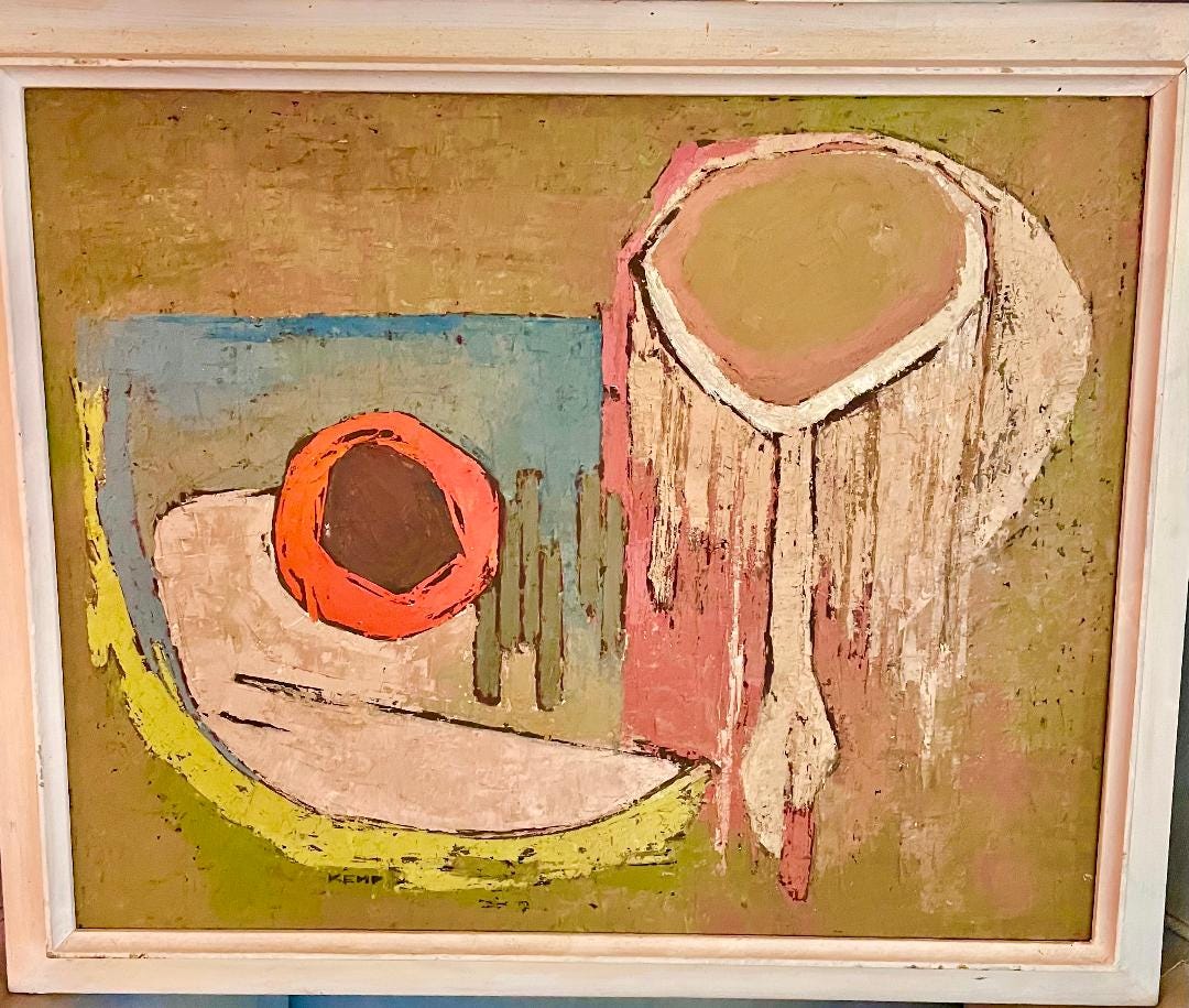
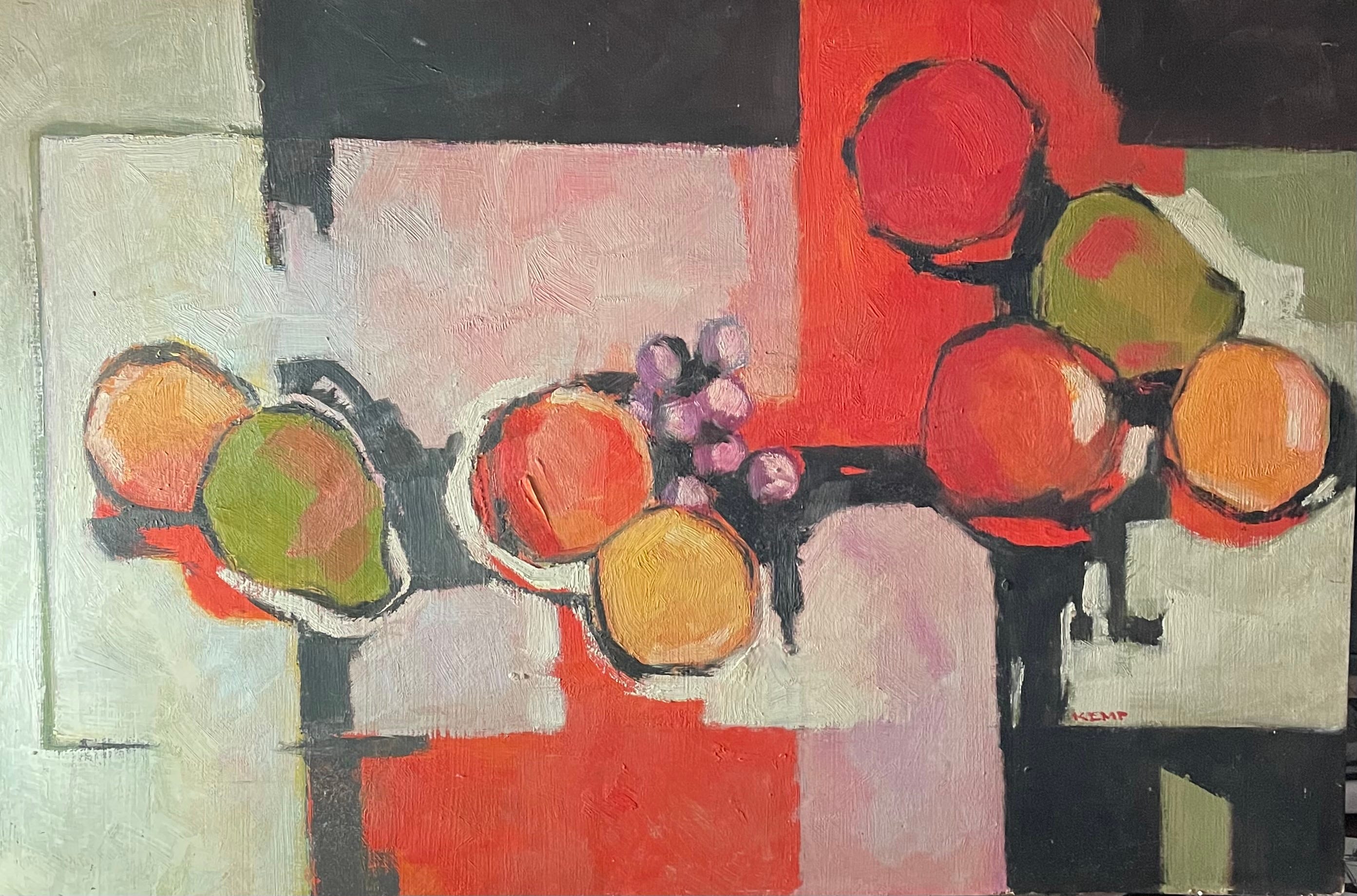
To live with Jim Kemp’s abstracts, two of which hang in my own living room, is to witness this relentless, joyful exploration of light and texture firsthand. Orange is a dominant colour in both paintings, a radiant, burning hue that pulses with an interior luminosity. Though his early work was anchored in representation, his travels through Europe evolved into a highly personal modernism that boldly pushed into abstraction. Strikingly, despite being red-green colour blind, he possessed an almost mystical command of underwater and autumnal tones: lustrous deep blues, vibrant greens, and these arresting, incandescent oranges.
His impressionistic dabs of oil and acrylic do not just sit on the canvas. In many of his paintings, his colour fields merge in a subtle sfumato border where transitions become almost imperceptible, shifting softly like light moving through water. By fusing these boundaries, he removes all hard, rigid outlines. Instead, the tones evaporate into one another, creating a dreamy, atmospheric effect that gives the composition a quiet, breathing depth.
The aesthetic lineage of this collection extends beyond her father’s studio to the book jacket, which features the iconic work of rebel regionalist Greg Curnoe. On the front cover, Curnoe’s vibrant colour wheel introduces the book with a jolt of local history and theory. Curnoe was a master colourist who, in a fascinating parallel to Jim Kemp, also defied his own partial red-green colour blindness. His painterly brushstrokes fill the wheel’s segments with independent fields of pure energy, turning a technical diagram into a playful declaration of identity. By wrapping her book in Curnoe’s wheel, Penn signals that this collection is a deliberate defence of our specific regional landscape. It sets a beautifully ironic stage: a bold, circular map of strict visual boundaries acts as the gateway to a collection where those very borders immediately dissolve.
Indeed, Penn looks beyond local borders to weave legendary historical painters such as Frida Kahlo, Diego Rivera, the Group of Seven, Dante Gabriel Rossetti, Pieter Bruegel, and Emily Carr into her narrative, expanding her exploration beyond regional constraints. Her ekphrastic tribute uses these figures to build an interconnected dialogue about how landscape, identity, and the artistic spirit merge. Yet, whether traversing international art history or defending local regionalism, the collection always returns to the literal space where art is born.
In her poem, “Translation,” Penn takes us directly into that sacred, physical labour behind the canvas. She recalls the rhythmic intimacy of priming her father’s raw surfaces with white gesso, preparing each substrate for his layered acrylics. In this memory, the act of translation begins long before words ever hit a page; it starts with the baseline of white, the literal ground from which her father’s vibrant oranges and deeper blues would eventually erupt. By grounding the book in this foundational act of physical preparation, Penn ultimately positions her poetry not just as a reaction to finished art, but as a direct continuation of a collaborative family dynamic.
As I continue to observe Penn’s work, I am constantly struck by how it thrives in these exact spaces—like a story within a story—where various art forms meet. She treats canvas not as a stationary object to be described, but as a vibrant, living field. Drawing on her six decades at the forefront of Canadian literary experimentalism, she possesses an innate ability to bridge the visual and the oral. Penn articulates that colour and sound are merely different frequencies of the same cosmic energy. To her, sound is generative, containing the primal potential for the dazzle and mystery of colours, forms, and images.
Several of Penn’s poems in this collection scumble across the page, completely discarding the tyranny of the rigid left-aligned margin. Words are scattered like loose pigment or arranged in sweeping, open-field compositions that mimic the expansive, edge-to-edge washing of a canvas. The white space of the paper ceases to be a void; it becomes a crucial ground of silence, a primal space where language dissolves back into pure color. - BL
Untitled, 1963. Oil on canvas. Collection of Museum London.
What an astute reading of poetry and painting in COLOUR FIELDING and beyond!